Thursday, December 15, 2022
Monday, December 12, 2022

Saturday, December 10, 2022

ETEC 511 Group Project Review and Retrospective
In this design process we created a guide site to using a very complex tool, TinkerCAD, as a beginner to Electronics ADST teacher.
In this project we initially tried assessing how to use the Classes feature of TinkerCAD, but in the end created a tool that simply tried to improve the usability of that limited-LMS in the context of non-microcontroller circuits.
 |
| from xkcd.com by Randall Munroe https://xkcd.com/2141/ |
The first challenge was an inability to go into priscilla mode and build our content within the TinkerCAD - Classes platform. This was frustrating and forced us to use the next best thing which was a series of glued together pieces of work that we believed a beginner ADST teacher would find engaging.
In navigation terms we laid out a very simple linear method of navigating the site which was designed to be as minimalist as it could be to avoid attentional overload. The pages with lesson plan PDFs and pre-built TinkerCAD circuits were coded in such a way that clicking them immediately downloaded or created new tabs for easy access to those resources.
Our work was to configure the user to get them used to the experience a variety of mediums (website, video, Genialy, simulator). This is simpler to the experience of being an ADST teacher where you are frequently expected to be an expert at many systems in those roles. In this sense the project was a success. I believe that those multi-modal resources are well put together and beginner friendly. A late addition to the project was the site walkthrough video which helps introduce the user to the navigation, format, and content which reinforces the idea that this is a guide to curated resources specific to the target audience.
Using Issa and Isaias's (2015) Usability Criteria we achieved some of the following:
Learnability
The site has been designed with easy entry points in the form of video tutorials/introductions as well as a Genialy animation that provides the expected feedback to “hand hold” someone getting started with this complex topic.
Flexibility
This is a place our project struggles. Being a limited scope we were not able to add many branching connections on the site to provide flexibility.
Efficiency
This tool is meant to solve an efficiency issue as the amount of effort required to find resources like these in the dark corners of websites like Instructables is immense and the payoff is minimal. Using this tool to its ceiling (which isn’t hard to do) provides massive payoff in terms of an ADST class.
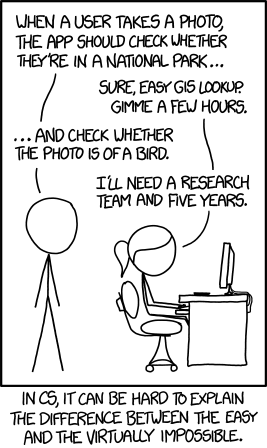 |
| from xkcd.com by Randall Munroe https://xkcd.com/1425/ |
In terms of what I learned: Design for usability is a slow and tedious process, testing for it doubly so. If I had to do this project again I would have spent less time on fighting with having a functional product and more time on the proof of concept; it may have taken a different form but our process definitely illuminates the challenge of managing sunk costs in development and how it can negatively affect usability.
Overall, I’m happy with this project. I feel as though it presented well in the synchronous session and the site is effective despite some technical limitations to implementation. It is a resource that I as a beginner complimentary course teacher would have coveted had it been available ten years ago.
Issa, T., & Isaias, P. (2015) Usability and human computer interaction (HCI). In Sustainable
Design (pp. 19-35). Springer.